Re-design Corporate Website
We started creating the low-fidelity wireframes. They are useful because we can iterate quickly, learn, and evolve. We showed them to a couple of users and iterated the design.
WHEN: 2015 - 2016
TEAM: 5 Designers
MY ROLE: Strategy, Information Architecture, Lead Designer
PLATFORM: Responsive Web for Desktop, Tablet, Phone
Goals
First Tech Fed credit union sought to undertake a redesign and development project for their corporate website, encompassing a vast array of over 200 pages. The objective was to create a responsive website that could be accessed seamlessly across various platforms, including desktop, tablet, and mobile devices.
We redesigned the dashboard, access points to find mange card functions, travel notification, lock, unlock, activation, and balance transfer. We simplified the interface and made it more intuitive as well as user friendly.
Challenge
Our existing website had such severe usability problems that we must redesign it in an aggressive time frame
Problems
Declining site visits, high bounce rate, low engagement rate, low SEO rank, no targeted marketing, lost in navigation
My Contribution
UX Manager/Lead
strategy, research, interaction design, visual design, collaborate with business partners, PM, mange designers, and user testing
Below are the processes we have taken while building the website
Research, Findings & Insights
To identify user experience issues within the website, we began by analyzing customer feedback and the results of empathy studies. It became evident that members expressed dissatisfaction with the existing site, primarily due to significant navigation difficulties. Here are a few comments from members regarding their experience with the website:
"The website is no longer easy to access and read"
“You need to reduce navigation clicks that were sacrificed in order to have a more modern layout feel”
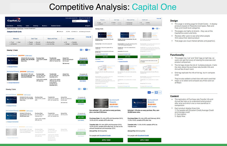
Competitive Analysis
We identified our competitors and evaluate their features and strategies to find their strengths and weaknesses relative to our products and services.

Prioritized Features
We started with initial basic requirements. To further refine these requirements, I organized a workshop involving stakeholders and a select group of users. The workshop items were prioritized using the Dot Voting method, allowing us to determine the most important elements and focus areas for the project.

Red Route Analysis
With all the critical and frequent user activities, it was necessary to define crisp red routes. As a result of the workshop, we easily understood the priority in terms of story (Agile) and prioritization of website content.

Define Information Architecture
The navigation aspect proved to be of utmost importance for the website as members expressed dissatisfaction with navigation issues. One prominent problem was the absence of a global navigation feature, which significantly impeded users from properly navigating the site. To address this, we initiated the process by conducting card sorting exercises to determine the optimal grouping of products. This exercise played a pivotal role in determining the usable structure of the global navigation system.
Card Sort

Mind Mapping
I used Mind Mapping to plan the website, as well as global navigation and the final sitemap. It helped the entire team to visualize and organize the content.

Design Process
Low-Fidelity Wireframe
To carefully consider the webpage structure, I began by creating low-fidelity wireframes. Using Axure, we iterated through the design process, allowing us to refine the wireframes further. We conducted user testing on these prototypes and continued iterating based on the feedback received. This iterative approach persisted until we achieved satisfactory results from the testing phase.

Hi-Fidelity Wireframe
After finalizing the structure of the prototypes, I proceeded to enhance the visual design by incorporating colors into the previously black and white prototypes. To create interactive prototypes, I utilized tools such as Sketch, Photoshop, and Axure. To ensure stakeholder engagement, I conducted regular demos every 15 days, gathering their valuable input. Throughout the design process, I maintained effective communication with all stakeholders and engineers, fostering a collaborative environment.

Final Look & Feel
Visual Design
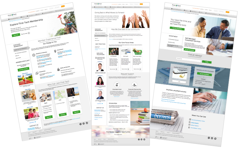
We published the fully functional responsive website. This website reached millions of people. Comments from the members were very positive.


Solutions To The Major User Painpoints
This redesigned website solved some critical usability problems as well as minor problems. Below are few major problems it solved.
Introducing Global Navigation
Finally, we created a clean and organized top navigation that was tested successfully with the users. We added drop down navigation to clean the interface. 9 out of 10 people were able to navigate between pages they intended to visit.

Product Comparison
Comparison is a common behavior among online shoppers, and it applies to the products offered by banks just like any other retail sites. Users compare various aspects such as rates, monthly account fees, and unlimited ATM fee rebates. They also compare different products within the same bank. Recognizing this behavior, we took user feedback into account, and it became evident that the previous website lacked a comparison feature. To address this, we introduced a comparison table, fulfilling the users' expressed need for an effective product comparison tool.

Introduced Dynamic Rate Table
Rate is the most important factor in any banking website. In the re-designed website, the fully functional dynamic real-time rate is provided to the user which replaced the Excel file.

Developer Hands-Off

Style Guide
I created detailed style guide ranging from colors to iconography, form fields, vertical rhythm of texts and buttons.
Design Pattern Library
I used Confluence to build the design pattern library for best practices and standards to ensure consistent user experience. It is also served as a repository of all user testing results.

Measure The Impact
Within 6 months, website gained visitors and improved overall performances

New visitors added
Secured 300k new visitors to the website

Bounce rate down
Reduced bounce rate by 2%